Why Are Watches with Arabic Numerals So Easy to Read?
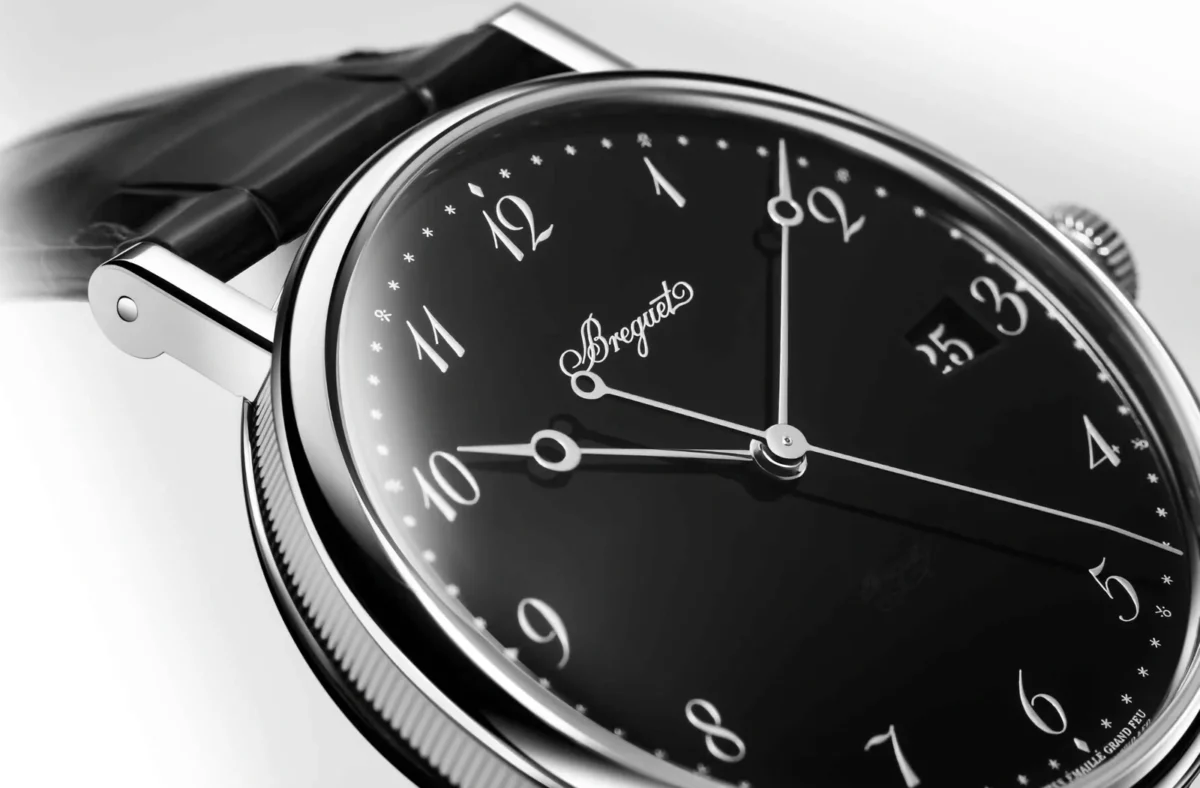
In the world of watches, everything can seem to come down to the details. A crown that is too large, a case that is too thick, an unbalanced dial—any one of these can make the alchemy disappear. Among these elements, the choice between Arabic numerals, Roman numerals or simple baton markers might seem trivial. It is anything but. Legibility is a question that runs through the entire history of watchmaking, and from that perspective, Arabic numerals still have the edge. Not because of any aesthetic affectation, but for profoundly rooted technical, cognitive and cultural reasons.
Reading the Time Instantly, Without Effort
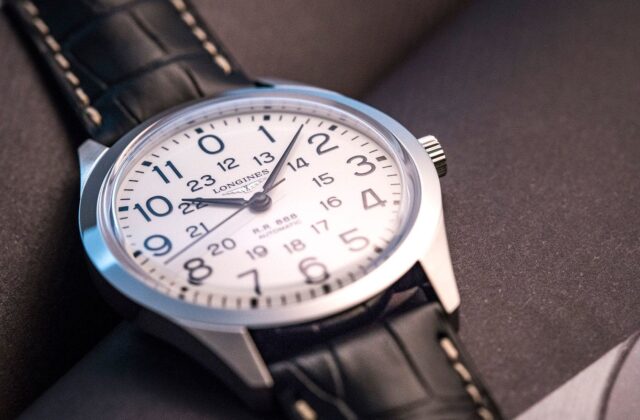
Reading the time should be a reflex, not an exercise in mental effort. The Arabic numerals we use every day can be read instantly because we learn them from an early age and associate them with powerful automatic responses. The brain does not translate them; it recognises them.
That is the major difference between Roman numerals and minimalist markers. Faced with “IV” or a simple baton at four o’clock, there is a brief moment—however fleeting—in which the eye must decode what it sees. It is a tiny interval, but it exists. And on a watch, that moment matters. Legibility is not merely a matter of comfort; it is a function.
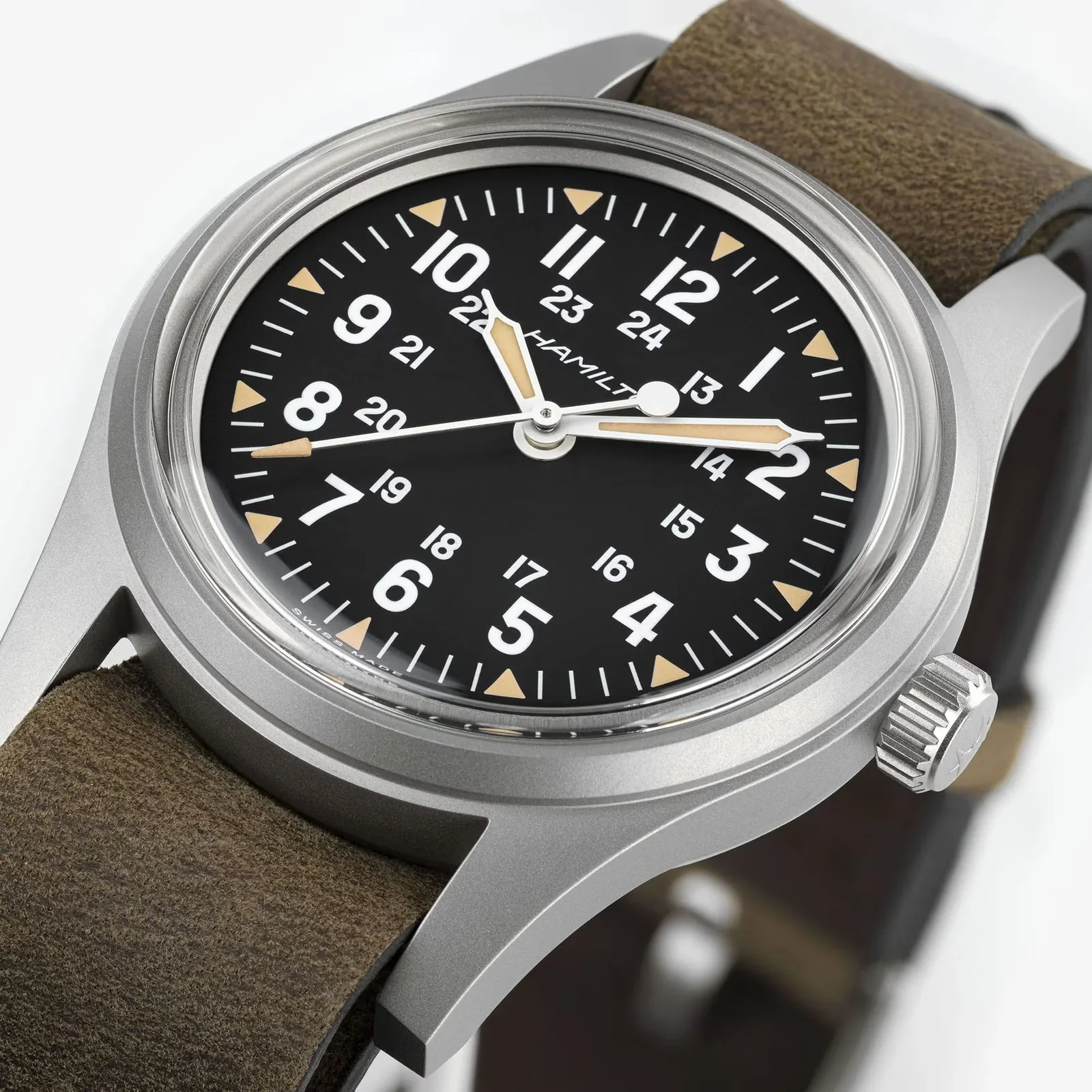
Pilot’s watches understood this early on. In the 1930s, the German Type A and Type B dials of the so-called Beobachtungsuhren adopted broad, high-contrast Arabic numerals, often combined with a clear peripheral minute track. Being able to read the time at a glance in a dimly lit cockpit was not a matter of design whim.
Typography Plays a Decisive Role
Not all Arabic numerals are equally effective. Legibility depends not only on the presence of numerals, but also on how they are shaped. Good typography carefully balances the openness of each form, the weight of its strokes and, above all, its contrast with the dial.
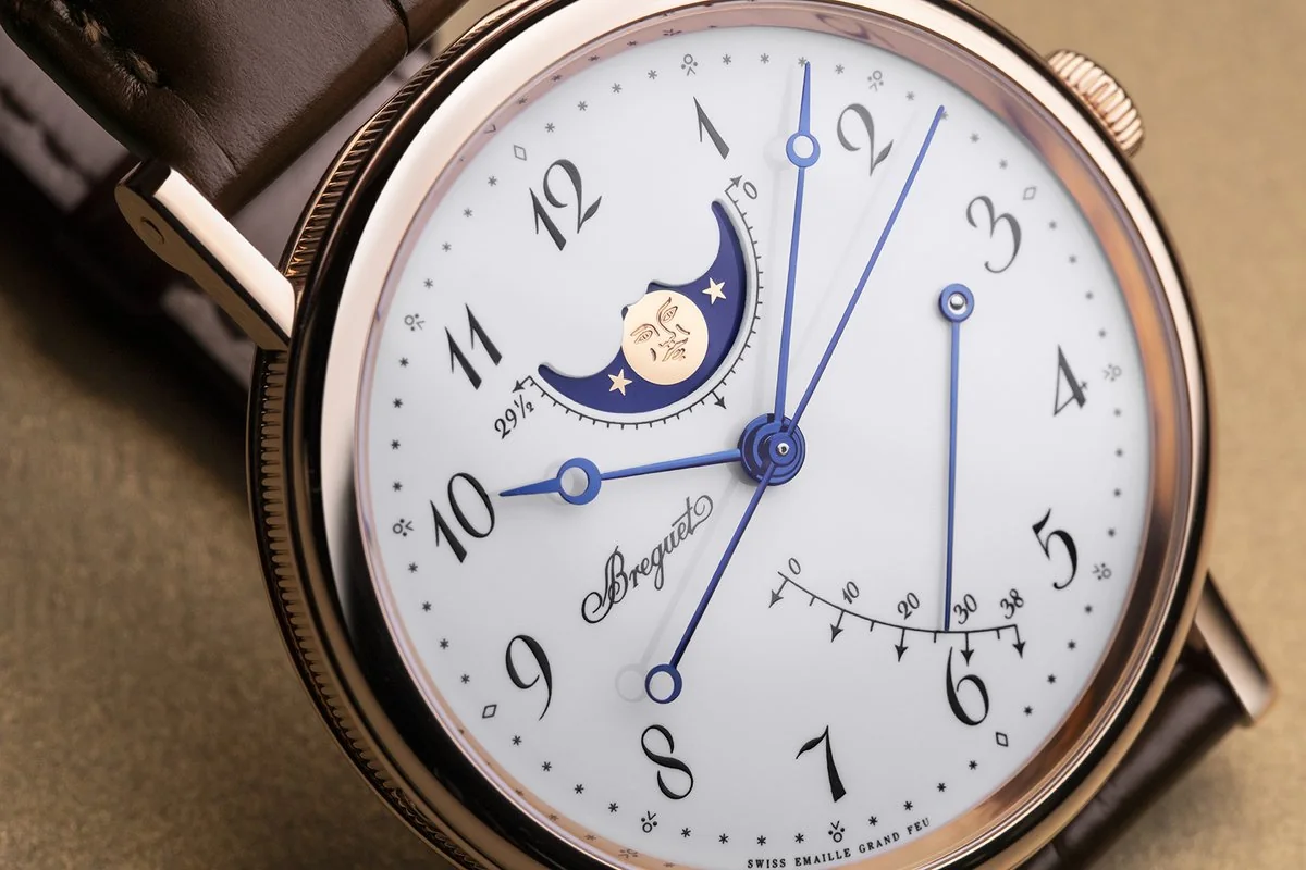
Consider the “3”, “6”, “8” and “9”. If their forms are poorly designed, they quickly become difficult to distinguish. Excessive ornamentation can also hinder readability. The great watchmakers understand this, and some have developed distinctive typographic identities of their own. Breguet, for example, elevated Arabic numerals to the level of art with its characteristic “pomme évidée” numerals. Their curved, almost calligraphic forms retain remarkable legibility.
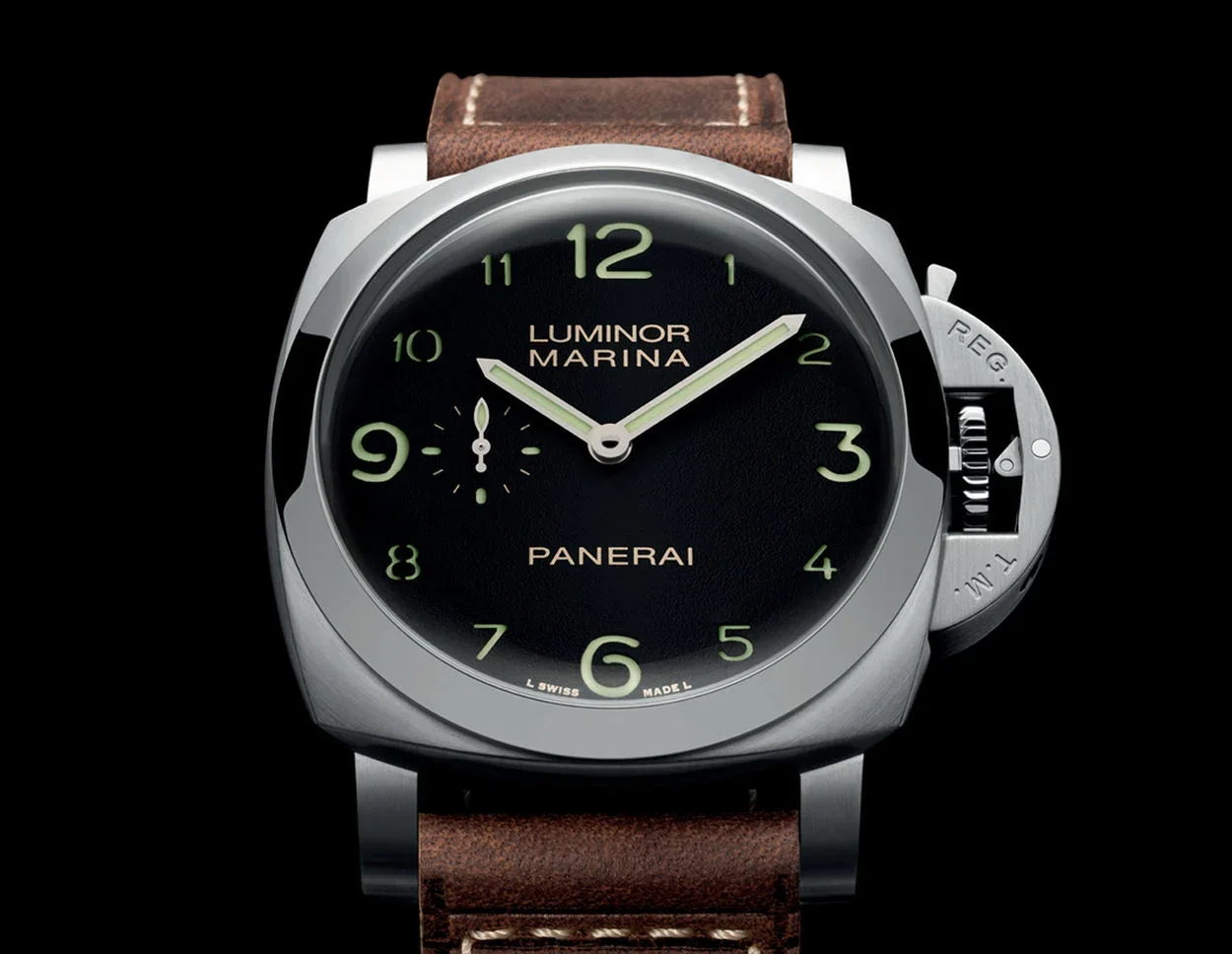
At the opposite end of the spectrum is Panerai, with its large, cut-out numerals on sandwich dials, brought to life by luminous material beneath them. Here, legibility is rugged and almost unmistakably military in character. There is no unnecessary elegance, only efficiency. Two different philosophies arrive at the same result.
Contrast, Size and Hierarchy
Legibility is not determined solely by the type of hour marker. Its interaction with the dial as a whole is equally important. Arabic numerals have a structural advantage: because they occupy more surface area, they make it easier to organise information visually.
A dial with Arabic numerals creates strong visual reference points for each hour. It is also easier to read using peripheral vision, without having to study the watch closely. By contrast, very fine baton markers can disappear in certain lighting conditions or on a textured dial.
Visual hierarchy is also clearer. On a tool watch, the principal numerals can be reinforced by a subsidiary minute track, a railway track or luminous markers. This arrangement allows the time to be read even when the watch is viewed at an angle. It is an essential quality in everyday life, yet one that is rarely discussed.
Luminescence and Night-Time Usability
In darkness, the argument becomes even clearer. Arabic numerals allow for broader, more uniform areas of lume than simple markers.
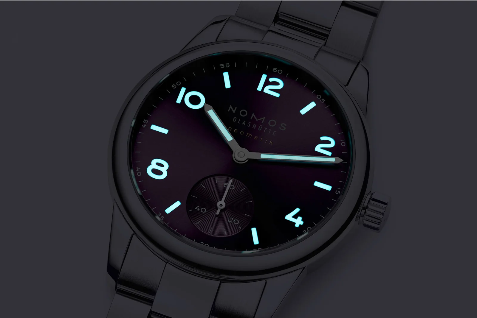
Whether Super-LumiNova, the tritium once used in the past or even radioactive paint from an era when regulations were less stringent, these materials are all more effective when applied to shapes filled across a broad surface. A luminous “12” is easier to identify than two bars. It also plays an important role in allowing the orientation of the dial to be understood instantly in the dark.
That is why so many military watches, from the British Army’s Dirty Dozen to contemporary field watches, continue to favour Arabic numerals.
A Decisive Advantage for Certain Complications
The more complicated a watch becomes, the greater the challenge of maintaining legibility. Chronographs, perpetual calendars and world timers all add information within a limited amount of space.
Arabic numerals provide fixed visual reference points. On a chronograph, for example, appropriately spaced numerals make it easier to read the time and elapsed-time indications simultaneously. On a dial prone to becoming visually crowded, they offer stable points of orientation.
Roman numerals, by contrast, can become visually overbearing, particularly because of their horizontally elongated forms. Try fitting “VIII” neatly onto a dial that is already rich in information. Best of luck.
Above All, It Is a Question of Purpose
To say that Arabic numerals are simply “better” would be an oversimplification. More precisely, they are better suited to watches designed as instruments. Wherever function takes precedence over form, they are the natural choice.
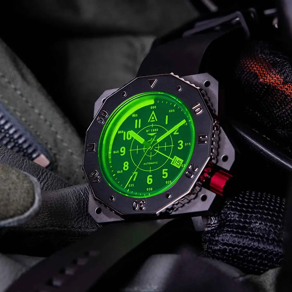
Yet watches are not defined by functionality alone. Roman-numeral watches from Cartier or Vacheron Constantin express a different set of values: a more classical, decorative interpretation of time. They also convey a more leisurely sensibility.
Baton markers occupy an almost abstract realm. They strip away detail, embrace a modern aesthetic and sometimes approach complete visual erasure. They are superb on minimalist dress watches, but it is difficult to call them champions of legibility.
Why Arabic Numerals Remain the Obvious Choice
Ultimately, the strength of Arabic numerals lies in a rare balance. They are universal, intuitive and highly adaptable. They suit an extraordinary range of styles, from military vintage watches to contemporary luxury pieces, without ever sacrificing legibility.
They harmonise equally well with sword, spade or Dauphine hands. They give structure to the dial without making it feel heavy. Above all, they fulfil a watch’s primary role: telling the time at a glance.
It is no coincidence that Arabic numerals keep returning, despite successive trends and experiments. A watch can be jewellery, a work of art or a form of self-expression. But in that moment when we casually glance down to check the time, Arabic numerals are usually what we read fastest.