The History of the Cartier Tank: A Watch Inspired by an Armoured Vehicle
When a war machine becomes a style icon
Some watches are born from a set of specifications. And then there are those that arrive as a visual jolt—almost a flash of insight. The Cartier Tank is a creation in which modernity doesn’t merely keep pace with its era; it shapes it. This approach recalls that of the first modern watch, the Santos de Cartier, which likewise managed to turn a functional necessity into an object of elegance. The idea is as paradoxical as it is compelling: to transform the look of an armoured vehicle seen at the front into an object of civilian refinement—designed not to conquer territory, but wrists.
In the collective imagination, the Tank has become a symbol of balance: clean lines, perfect proportions, a timeless presence. Yet its name points to a far rougher reality, evoking the world of vintage military watches which, in their own way, have also captivated through robustness and history. It is precisely this contrast—the brutality of the reference and the civility of the result—that makes the Tank a watch that is both a witness to history and a design manifesto.
1917: Louis Cartier, the war, and the idea of the rectangle
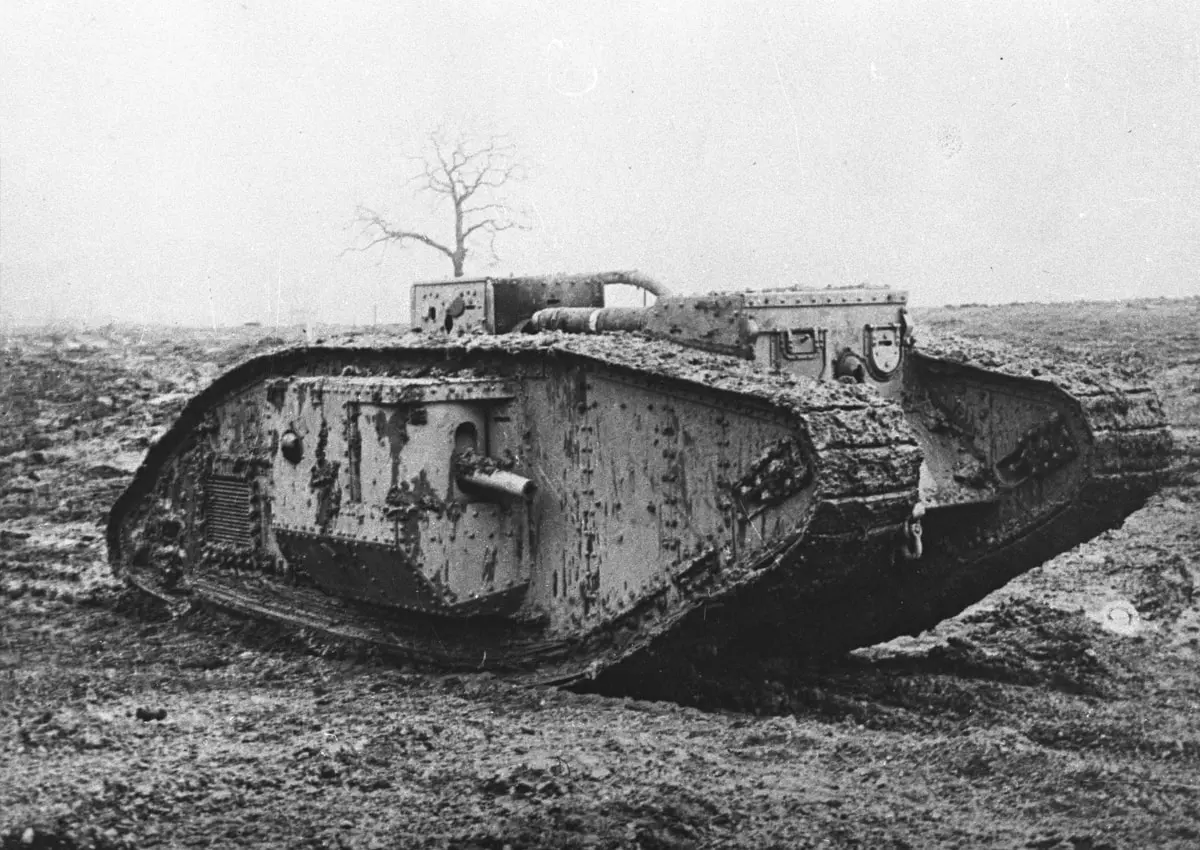
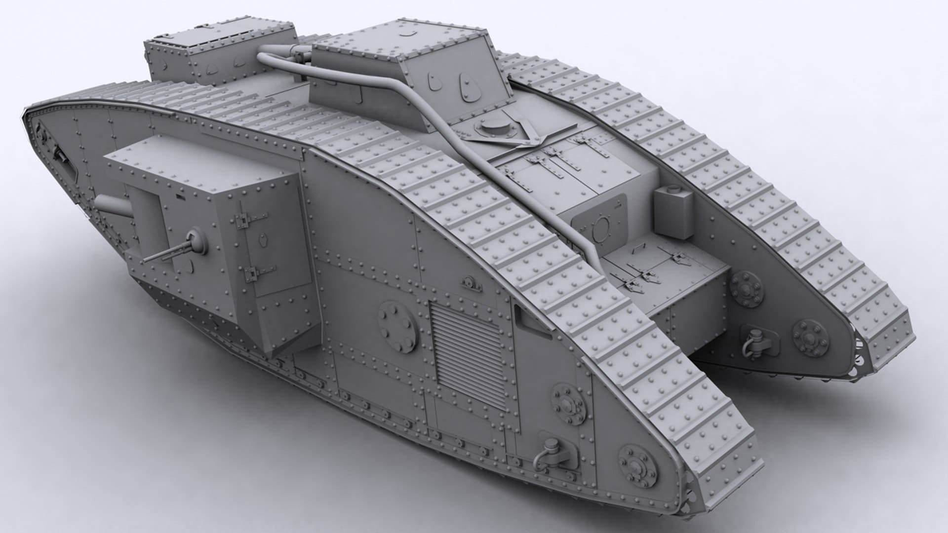
It is 1917. Europe is exhausted by the First World War. The industrialisation of war imposes new forms: angles, plates, tracks, mechanical silhouettes. Louis Cartier—grandson of the house’s founder and a central figure in its early 20th-century rise—observes this aesthetic shift. According to the most frequently cited account, he is struck by the sight of the first tanks—particularly the Renault FT-17 and the British Mark IV and Mark V—and by this unprecedented geometry that cuts against the traditional roundness of watchmaking.
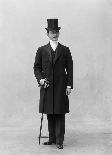

Inspiration here should not be understood as a simple military tribute. It is closer to what the era called a taste for the modern: an attraction to crisp lines, legible volumes, rationality. While the pocket watch still reigns, the wristwatch is beginning to emancipate itself. The Tank will crystallise that precise moment: the instant the watch leaves the purely utilitarian sphere to become an object of design.
An “armoured” design: reading a silhouette
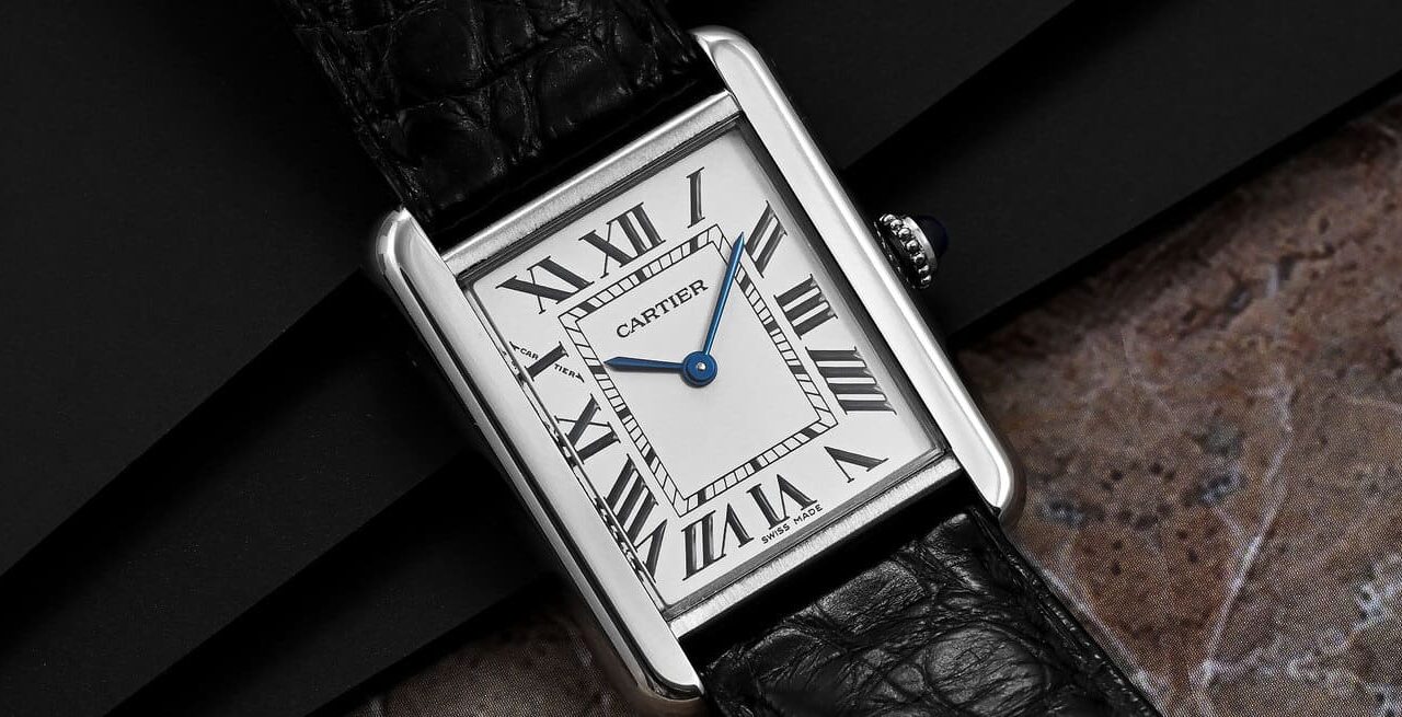
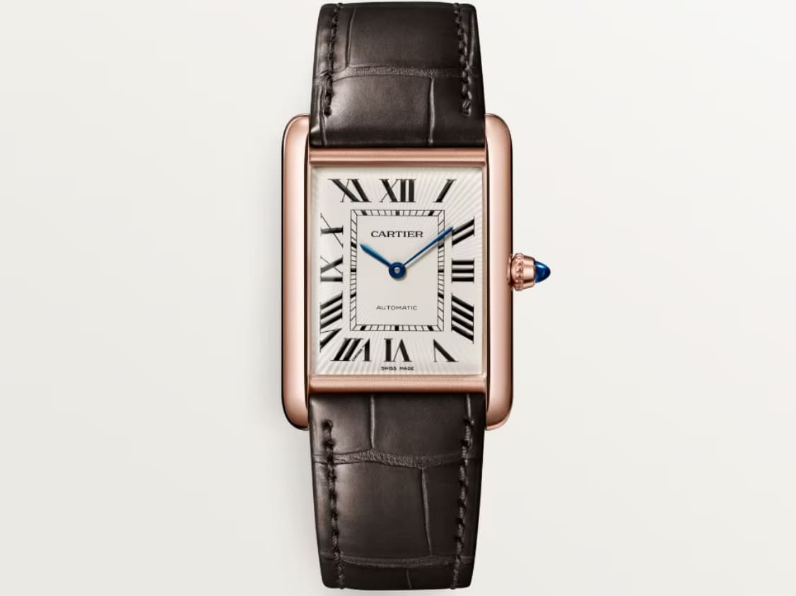
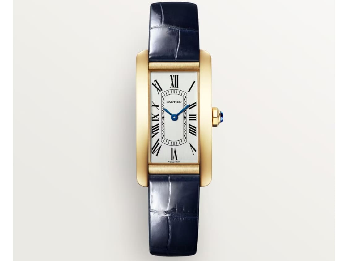
What immediately sets the Tank apart is its architecture. The case is no longer a circle placed on a strap; it becomes a composition. Two vertical sidebars (Cartier’s famous “brancards”) frame a rectangular dial and extend towards the strap attachments. This is where the allusion to the tank resides: the brancards evoke the tracks, while the dial forms the central body—stable and strict, like a cabin.
But the Tank doesn’t merely aim to be geometric: it is designed to be worn. The proportions are studied to sit naturally on the wrist, and the lines—despite their rigour—retain an almost architectural softness. Add to that Cartier’s signature—Roman numerals, a railway minute track, blued sword-shaped hands, and a crown set with a cabochon—and you get a rare synthesis: modernist discipline softened by Parisian elegance.
Luxury, Cartier-style: legible, graphic, instantly recognisable
The Tank is one of those objects you can recognise from across the room. It doesn’t need spectacle. Its power lies elsewhere: in the self-evidence of its drawing. At a time when watchmaking was still searching for alternatives to the round, Cartier proposed a rectangle that was anything but a whim. It was a new visual grammar—and, for many, one of the 20th century’s most successful.
From prototype to myth: the first Tanks
Legend has it that the first examples were presented in 1918 to General John Pershing, commander of the American forces in Europe. Whether this episode is strictly documented or magnified by collective memory, the idea conveys something essential: from the outset, the Tank is embedded in a network of influence, power, and modernity.
True commercialisation begins in the early 1920s, and the object quickly finds its audience: artists, writers, aristocrats, society figures. The Tank becomes the kind of watch you wear with a well-cut suit, a straight overcoat, a leather diary. It accompanies the emergence of a new urban, international style—one that favours discreet yet unmistakable signals.
The Tank as a cultural accessory: when cinema takes it up
A watch becomes iconic when it transcends its function and accumulates stories. The Tank achieves this better than most: it appears on wrists that matter, travels through decades of imagery, and ultimately comes to embody a certain idea of elegance.
Whether you see it as the natural ally of a minimalist wardrobe, as a dandy object, or as a piece with androgynous chic, the Tank has a rare quality: it adapts without betraying itself. It can become jewellery, an aesthetic instrument, or a detail with character. And that versatility, paradoxically, comes from its formal radicalism.
A watch of attitude, not just status
Many timepieces signal success. The Tank, instead, speaks to a relationship with style: a taste for drawing, a fascination with well-considered objects. It’s a watch that says, “I know what I’m wearing,” without raising its voice. A form of intellectual, almost graphic luxury.
Evolutions and variations: one family, several silhouettes
Over time, the Tank has given rise to a true lineage. Cartier has managed to preserve the model’s DNA while reinterpreting it—proof that good design can be varied without becoming banal. Among the most notable variants are:
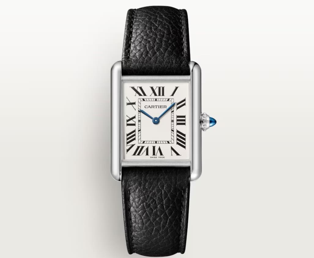
Tank Louis Cartier
The “purest” version, closest to the original spirit, often considered the archetype.
Tank Américaine
More elongated, more cinematic, with a stronger presence on the wrist.
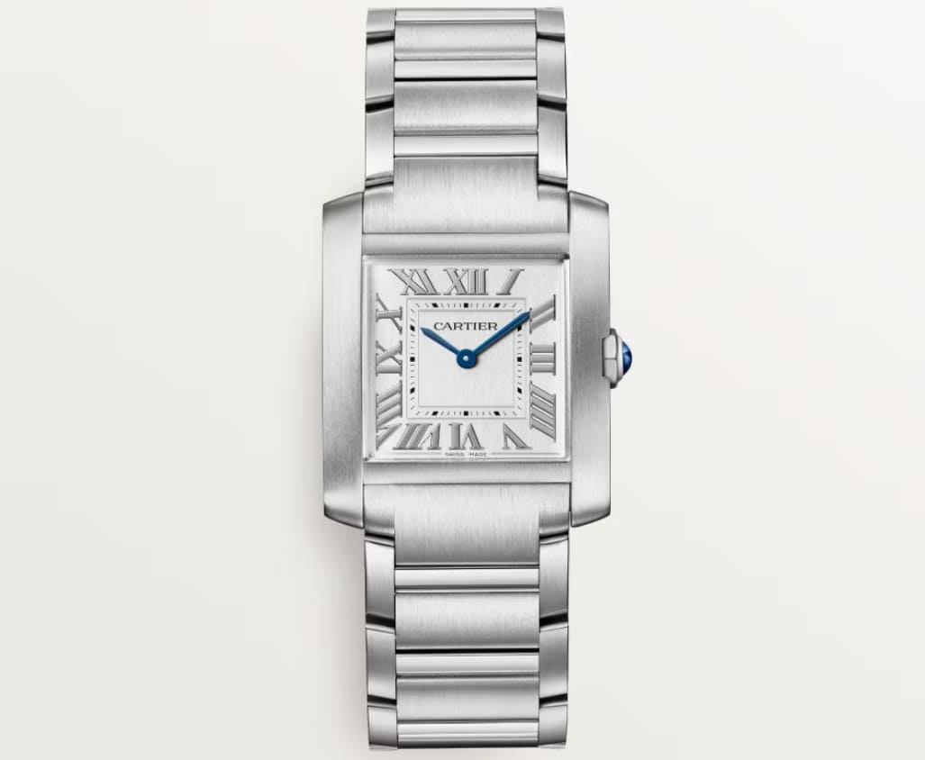
Tank Française
More integrated with the bracelet, more urban—almost architectural in its construction.
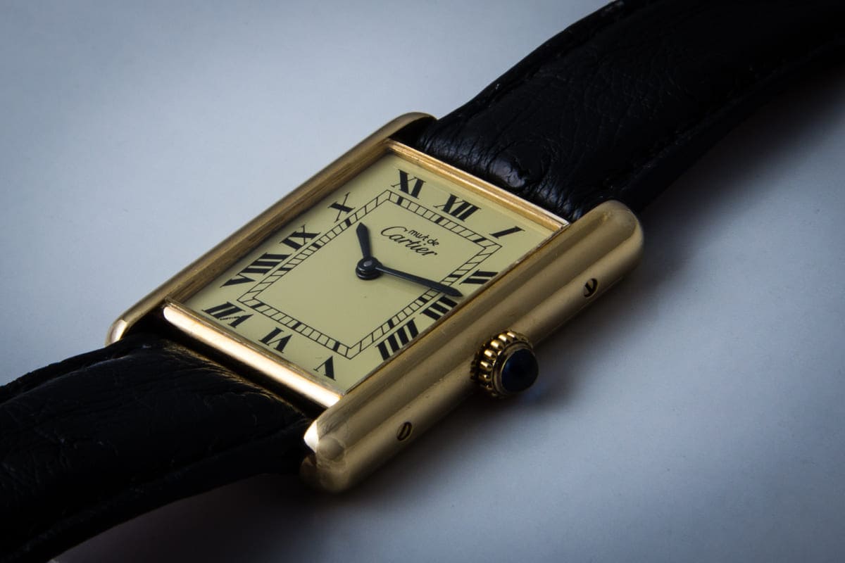
Tank Must
An emblematic entry point into the Tank universe, which helped democratise the Cartier look.
Each variation tells the story of an era: the lengthening of cases, the integration of the bracelet, the evolving relationship to the watch-as-jewel, or the recent return to more classic sizes. Yet all share one common point: that way of carving up space, of framing time the way one frames an image.
Why the Tank transcends trends
The Tank’s longevity is not due solely to its name or the power of the Cartier house. It comes down to a very rare equation: a silhouette that remains modern because it was modern from the start. Where some designs age by tying themselves too closely to a decade, the Tank sits above the cycles: it inherits from Art Deco, but is not imprisoned by it.
It also has a decisive advantage: it doesn’t try to prove anything. No excessive mechanical showmanship, no escalation in size. Its elegance is an architecture. And that architecture—like a fine Haussmann building—continues to command respect without demanding attention.
A watch that tells history without flaunting it
What’s most fascinating is what we sometimes forget: behind this refined watch lies a historical moment—a war, an industrial mutation. The Tank is an object of civilisation, born from a world collapsing and rebuilding. To wear a Tank is to wear a fragment of the 20th century, transfigured into clear lines.
What to remember: an icon born of an aesthetic shock
The story of the Cartier Tank is one of transformation. Louis Cartier observes a hard, military, functional form and extracts from it an idea of purity. He civilises it, polishes it, makes it wearable—and in doing so invents a watch whose modernity will endure. It isn’t merely a “beautiful watch”: it is a design lesson, a cultural landmark, a symbol of style.
In a watch world sometimes obsessed with performance or rarity, the Tank reminds us of a simple truth: some creations become eternal because they are, first and foremost, right. And because they can tell—silently—a story larger than themselves.