Why Watches with Arabic Numerals Are More Legible
In watchmaking, everything seems to be a matter of detail. A crown that’s too large, a case that’s too thick, a poorly balanced dial, and the alchemy disappears. Among these often-debated elements, the choice of indices—Arabic numerals, Roman numerals, or simple batons—may seem trivial. It isn’t. The question of legibility runs through the entire history of the watch, and on that front, Arabic numerals retain a clear edge—not out of aesthetic snobbery, but for deeply technical, cognitive, and cultural reasons.
Instant reading, without effort
Reading the time should be a reflex, not a task. Arabic numerals—the ones we use every day—offer immediate legibility. We learn them in childhood, and they are tied to powerful ingrained habits. The brain doesn’t translate; it recognizes.
That’s the key difference with Roman numerals or minimalist markers. Faced with an “IV” or a simple baton at four o’clock, a split second of decoding is required. Infinitesimal, but real. And in watchmaking, that fraction of a second matters. Legibility isn’t just comfort; it’s a function.
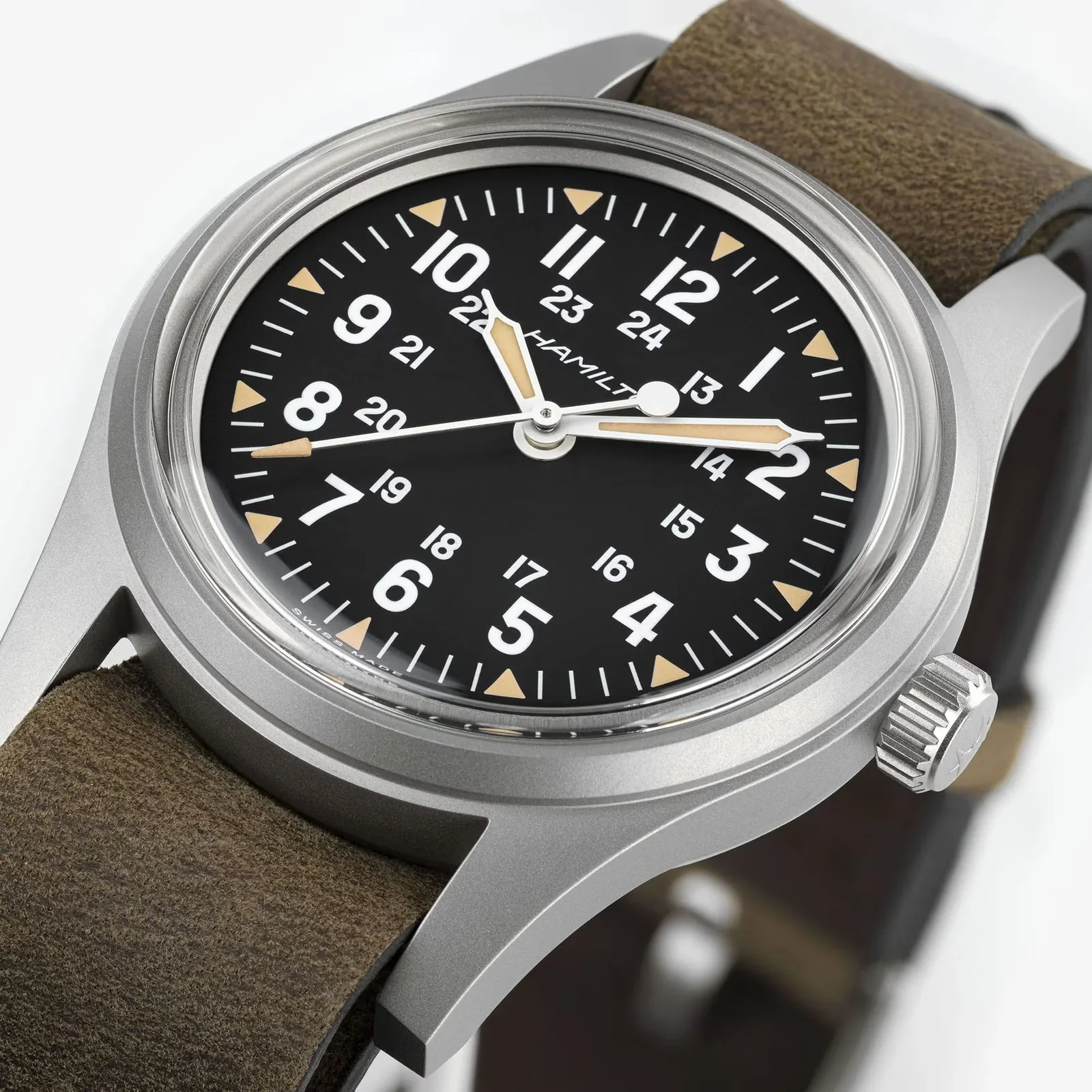
Pilot’s watches understood this early on. As far back as the 1930s, German Type A and Type B dials—the famous Beobachtungsuhren—featured large, high-contrast Arabic numerals, often paired with a clear peripheral minute track. Reading the time at a glance in a dim cockpit was never a design flourish.
The decisive role of typography
Not all Arabic numerals are created equal. Their legibility depends as much on their presence as on their design. Well-executed typography plays on open forms, stroke thickness, and above all contrast with the dial.
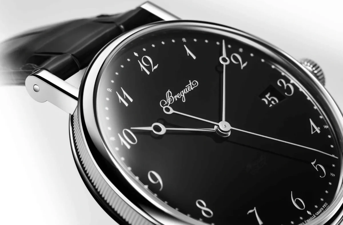
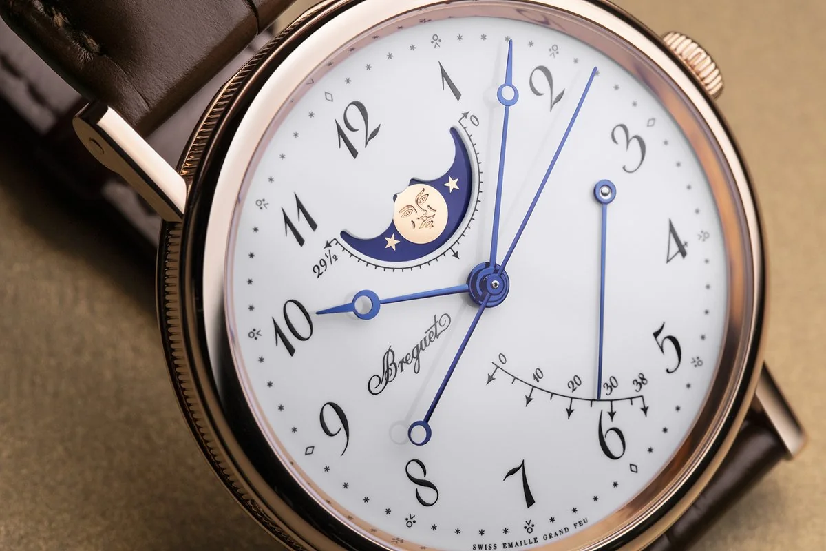
Take the numerals “3,” “6,” “8,” or “9.” Poorly drawn, they become confusing. Over-stylized, they hinder readability. The major watch houses know this, and some have developed their own typographic signatures. Breguet, for example, elevated the Arabic numeral to an art form with its famous hollowed “pomme” numerals—curved, almost calligraphic, yet remarkably legible.
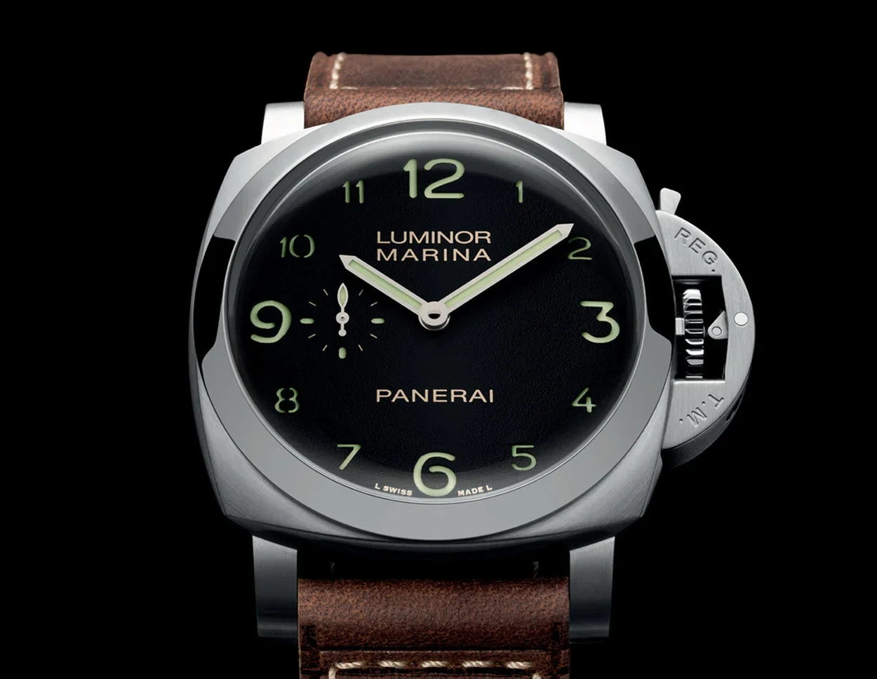
At the opposite end, Panerai opts for bold, blocky numerals cut into sandwich dials, where the luminous material shines through. Here, legibility is raw, almost military. No superfluous elegance, just efficiency. Two philosophies, one result.
Contrast, scale, hierarchy
Legibility doesn’t depend solely on the type of indices, but also on how they interact with the rest of the dial. Arabic numerals offer a structural advantage: they occupy more space and help organize information visually.
A dial with Arabic numerals creates strong reference points at each hour. This makes peripheral reading easier—the kind we use without really looking at the watch. By contrast, very thin baton markers can disappear in certain lighting conditions or on textured dials.
Visual hierarchy is also clearer. On a tool watch, primary numerals can be reinforced by a secondary minute track, a railway track, or luminous markers. This structuring makes the watch “readable at an angle,” a rarely discussed but essential quality in real life.
Luminescence and nighttime use
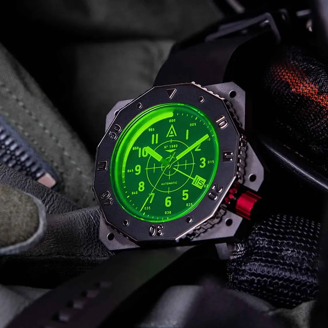
In the dark, the debate becomes even more clear-cut. Arabic numerals allow for a larger, more uniform luminous surface than simple markers.
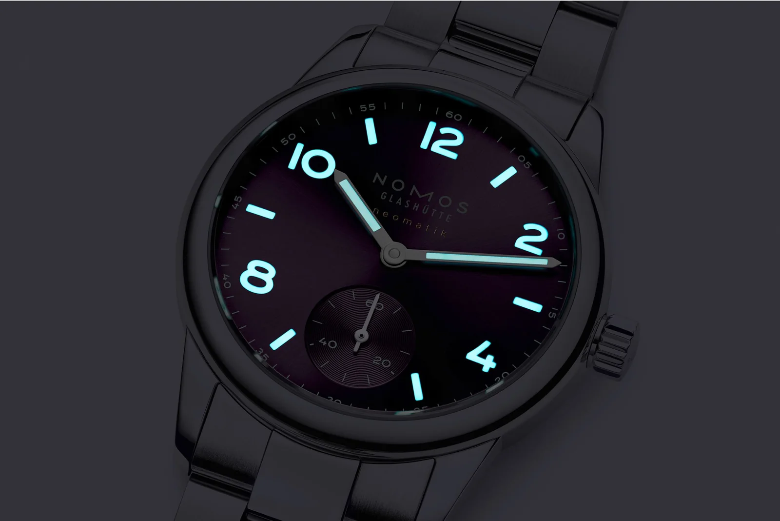
Super-LumiNova, tritium in the past, or earlier radioactive paints—all these materials are more effective when filling solid shapes. A luminous “12” is more identifiable than a pair of batons. It provides immediate orientation on the dial, which is essential in the dark.
This is why many military watches, from the British Dirty Dozen models to contemporary field watches, still favor Arabic numerals today.
A decisive advantage for certain complications
As watches become more complex, legibility becomes a challenge. Chronographs, complete calendars, world timers—all these complications multiply information within a limited space.
Arabic numerals help anchor the eye. On a chronograph, for instance, well-spaced numerals make it easier to read the time and the sub-dials simultaneously. They serve as fixed points on an otherwise crowded dial.
Roman numerals, by contrast, can become visually intrusive, especially with their elongated forms. Try integrating an “VIII” neatly into an already busy dial. Good luck.
A question of purpose above all
To say that Arabic numerals are “better” would be simplistic. Let’s say they are better suited to a watch conceived as an instrument. Where function takes precedence over form, they impose themselves naturally.
But watchmaking isn’t only about functionality. A watch with Roman numerals, whether from Cartier or Vacheron Constantin, offers something else—a particular conception of time, more classical, more ornamental. Less hurried, too.
Baton markers, meanwhile, verge on abstraction. They refine, they modernize, sometimes to the point of near erasure. Magnificent on a minimalist dress watch, but rarely champions of legibility.
Why Arabic numerals remain the obvious choice
Ultimately, the superiority of Arabic numerals rests on a rare balance. They are at once universal, intuitive, and adaptable. They suit a wide range of styles, from vintage military to contemporary luxury, without ever sacrificing legibility.
They pair effortlessly with hands of all kinds—sword, syringe, or dauphine. They structure the dial without weighing it down. And above all, they fulfill the primary function of a watch: telling the time, immediately.
It’s no coincidence that, despite shifting trends and constant experimentation, they always return. A watch can be a jewel, a work of art, a statement. But when it comes time to check the hour—often without thinking—it’s Arabic numerals that we read the fastest.