Why Some Watches Have a Sandwich Dial
A dial that plays with depth
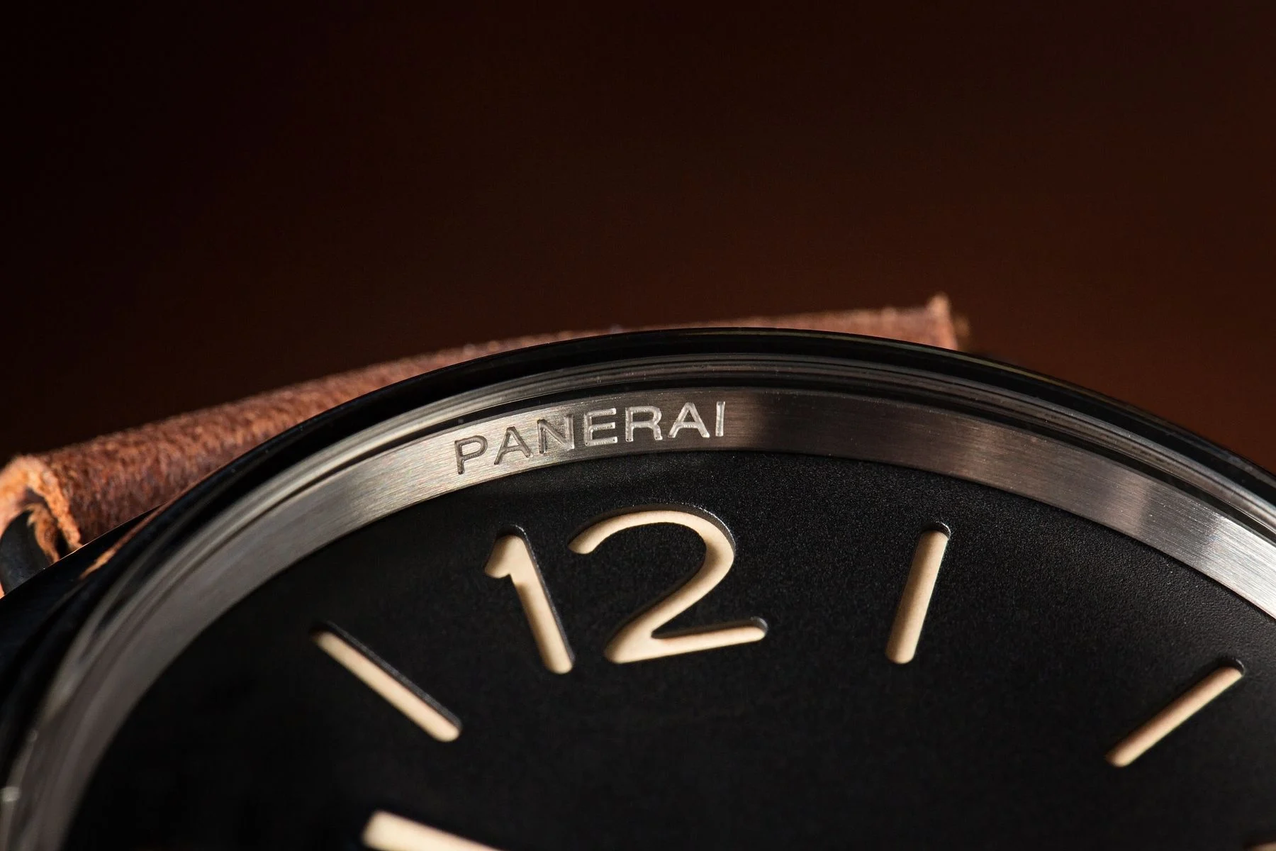
At first glance, you notice a sense of relief, an almost graphic legibility, as if the numerals and markers had been cut straight out of the material. This clarity is reminiscent of pilot watches, where legibility is a military necessity, ensuring that oversized numerals and sharp contrasts serve not just aesthetics, but survival. You’re looking at a “sandwich” dial.
Rather than applying raised indices or simply printing them, two plates are layered—one cut out, the other luminous—to create a display that is both technical and striking, reminiscent of the precision and functionality found in military-style watches that have significantly influenced modern design.
While enthusiasts instinctively associate it with certain military-style watches or “tool watches,” the sandwich dial has long since outgrown that niche. It speaks as much to functionality as it does to watchmaking culture: the world of workshops, the constraints of legibility, and that obsession with beauty that so often grows out of pragmatism.
What exactly is a sandwich dial?
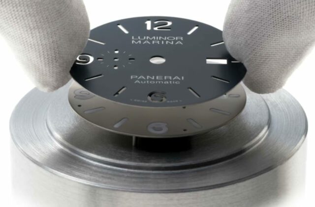
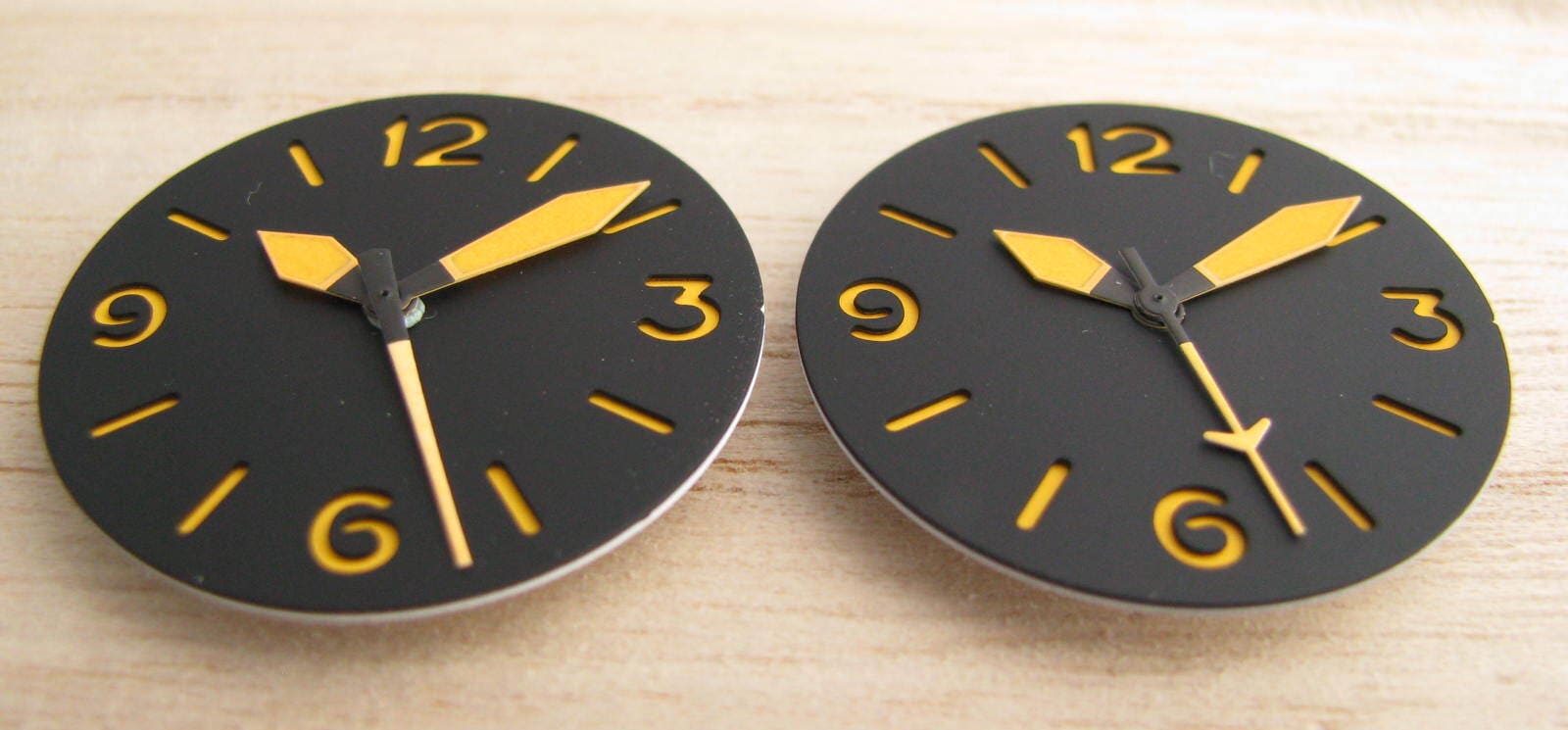
The principle is simple—almost engineer-like: a sandwich dial is made up of two layers (sometimes more). The top layer is a dial disc in which the numerals and/or indices are cut out. Beneath it, a second layer—generally coated with luminescent material (Super-LumiNova today, radium- or tritium-based paints in the past)—fills those openings from below.
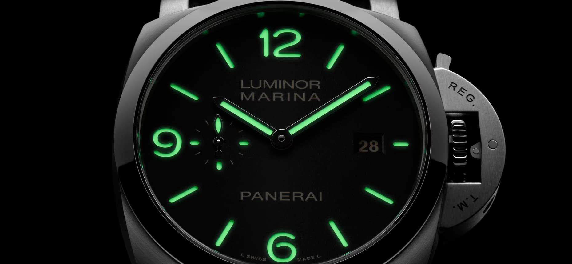
The result: by day, the dial shows a depth and crispness of outline that simple printing can hardly replicate. By night, the luminous compound—often more generously applied than on traditional painted markers—typically delivers a powerful glow with excellent legibility.
Sandwich vs applied indices: two philosophies
Applied indices (small metal pieces set onto the dial) lean into luxury, sparkle, and architecture. The sandwich approach, by contrast, prioritises efficiency and a more instrumental aesthetic: a world of clean cut-outs, discreet volumes, and bold contrasts. That doesn’t preclude a high-end execution—quite the opposite: the slightest irregularity in the cut is immediately visible.
An origin shaped by legibility… and history
Why did this solution appear in the first place? Because for a long time, the watch was an instrument more than a piece of jewellery. Legibility is a military, aeronautical, and nautical legacy. In those environments, a dial must be read quickly, anywhere, and stand up to time.
The sandwich dial established itself as an elegant answer to a very practical problem: how to achieve crisp, thick, durable luminous markers without adding fragile applied parts or multiplying delicate painting operations? By cutting through the top layer, you get perfectly defined numerals, while the lower layer can hold a more comfortable amount of luminous material.
Panerai, the collective imagination, and the legend
In contemporary watch culture, the sandwich dial immediately evokes Panerai. The Florentine brand did a great deal to popularise the style, tied to watches made for Italian combat swimmers in the 20th century. Whether we’re talking strict history or watchmaking myth, the image is powerful: a dial designed to be read in the dark, underwater, with stencil-like typography.
It’s no coincidence that the sandwich concept pairs so well with military codes: generous numerals, a railroad minute track, bold hands. The dial becomes signage—almost a poster.
Why some brands still swear by it today
At a time when anything is possible—enamel, lacquer, textured, fumé, galvanic, guilloché dials—why go back to two stacked plates? Because the sandwich dial creates a rare sensation: that of a made object, not merely a decorated one.
- Visual depth: the cut-outs create a natural relief that catches the light, even on a matte dial.
- Enhanced legibility: numerals and indices appear sharper, especially in challenging conditions.
- Often more generous lume: the lower layer allows a thicker application of luminous material.
- Aesthetic identity: a sandwich dial has an immediately recognisable presence.
A “utilitarian chic” aesthetic
The sandwich has become a language. It tells the story of a watch conceived as a tool, yet worn as a style statement. In a world of smooth surfaces and screens, this discreet relief is appealing: it feels like reading something mechanical, tangible, constructed.
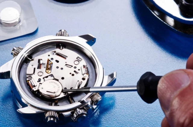
How is a sandwich dial made?
Behind the scenes, it’s not a “simpler” dial. The layers must be perfectly aligned, the cut-outs must be clean, tolerances must be controlled, and the final look must be mastered. Any shift, any burr, becomes a visible flaw.
The main steps (simplified)
- Cutting/openworking the top plate (laser, milling, or punching depending on the method).
- Finishing the surface (sandblasting, brushing, lacquering, PVD treatment, etc.).
- Applying the luminescent material to the lower disc (or inserting a luminescent material).
- Assembling the two layers, with precise alignment and durable fixing.
What makes a good sandwich dial beautiful is often what you don’t immediately notice: the crispness of the internal angles, the absence of burring, and the play of shadow created by well-executed cut-outs.
The limits and trade-offs of the sandwich dial
Like any solution, the sandwich has its constraints. The added thickness can influence dial construction and hand height. Typography must be designed with cutting in mind: very fine or highly complex fonts tend to work less well.
And then there’s the question of style: a sandwich dial brings a strong graphic presence. On a dress watch, it can feel too “instrument-like.” On an ultra-minimalist piece, it can seem too expressive. In other words, it’s a choice with character.
Why the sandwich dial is making a strong comeback among enthusiasts
The sandwich dial’s current success owes a lot to the return of watches with functional charm: field watches, understated dive watches, and pieces inspired by vintage military designs. The sandwich fits into this desire for perceived authenticity—not a naïve nostalgia, but the search for a design in which function has sculpted form.
There’s also a very watchmaking kind of pleasure: looking at the dial from an angle, feeling the typography “carved” into it, appreciating the lume that lights up like a road sign in the gloom. The sandwich dial is a small daily stage set—subtle, yet addictive.
What to remember before choosing a watch with a sandwich dial
A sandwich dial isn’t just a styling trick: it’s a construction that improves legibility and gives the dial real architecture. If you like watches with a utilitarian temperament, bold contrasts, and subtle relief, there’s a strong chance it will win you over.
And if you’re unsure, try a simple test: look at the watch from several angles and in low light. A good sandwich dial is instantly recognisable by its depth and the crispness of its cut-outs. When it’s well done, you’re not just reading the time—you’re reading an intention, a culture, a heritage.