Why Is It Always 10:10 in Watch Photos?

You’ve no doubt noticed that brands’ advertising images almost always show watches set to 10:10. Some will venture to explain this phenomenon with slightly twisted theories, invoking the Illuminati, extraterrestrials, or the NSA.
To those people, I feel like saying you might want to make sure you relax a little, drink a Yogi Tea, run yourself a bath—because burnout is lurking.
Why are watches set to 10:10? Some attempts at an answer.
I don’t buy the story about the signing of the agreement concerning the choice of the “0 meridian” supposedly having taken place at 10:10 during the 1184 International Conference in Washington, as several sites claim—sites that have clearly given in to the temptation of copy/paste, the cheeky devils they are (right, guys?! Here or here).
Let’s now look at the reasons behind a practice that has become a rule when it comes to presenting a watch. The main reason would be (I’m using the conditional, brave soul that I am) simply aesthetic!

Here are several facts supporting this thesis:
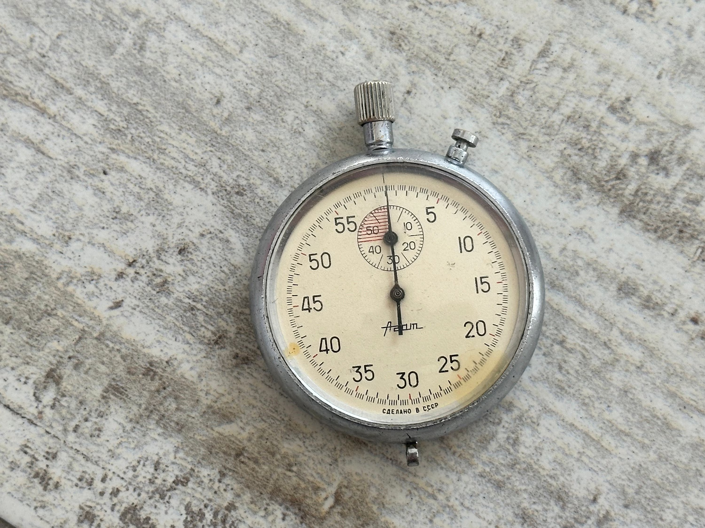
- At 10:10, the hands create a pleasing symmetry and lend a certain harmony to the watch (though 10:09 or 10:11 also appear depending on the photos).
- The brand logo is often found at 12 o’clock, so the hands frame the name.
- The date window is often placed at 4 o’clock.
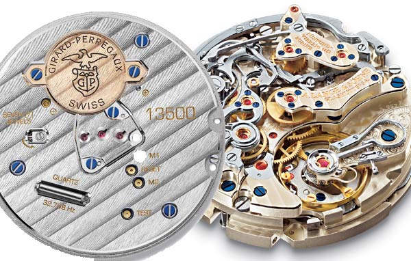
- In the case of chronographs, the sub-dials sit at 3, 6 and 9 o’clock, reducing the options for hand placement.
- At 10:10, the hands don’t obscure “classic” complications (moon phases, power reserve, etc.) generally positioned elsewhere on the dial.
Beyond aesthetics, the weight of tradition plays a major role, and brands and photographers apply this rule almost automatically.
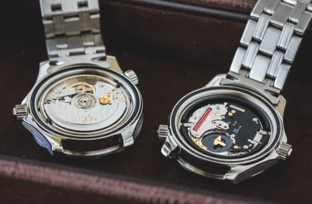
In some cases, common sense prevails and good old 10:10 is swept aside so as not to hide important parts of the dial, as below.

Note that some brands like to display a date that is significant in their history.
If you know of other explanations—far-fetched or not—the comments are open!