Why Do Pilot Watches Have Such Legible Dials?

Legibility born of noise, cold and urgency
Before it became an aesthetic code—oversized numerals, sharp hands, crisp contrasts—the legibility of pilot’s watches was a matter of survival. In a period cockpit, you don’t contemplate the time: you snatch it at a glance. Engine vibration, thick gloves, shifting light, stress, altitude, condensation… The watch isn’t jewellery but an instrument. And when navigation depends on a heading calculation or fuel timing, losing a second deciphering a dial can be costly.
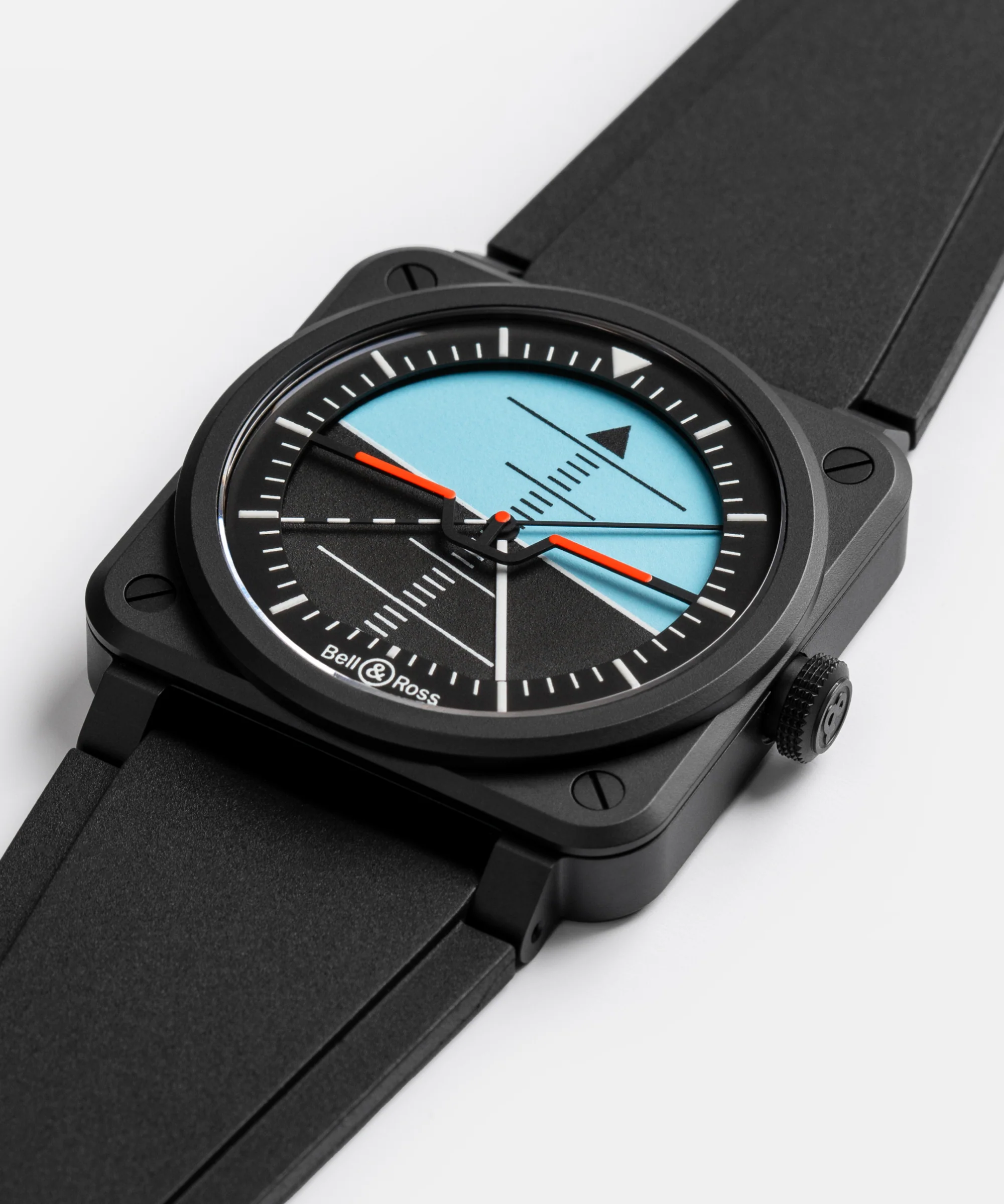
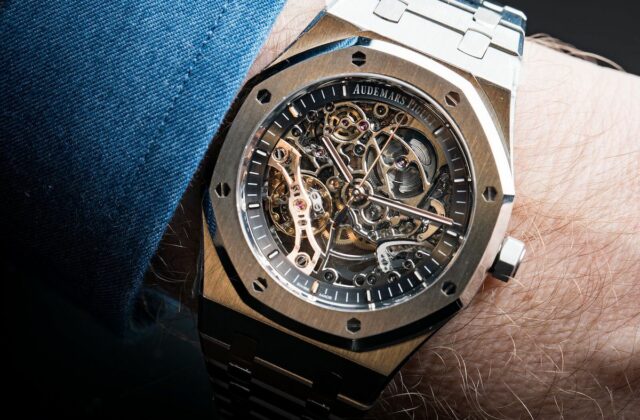
This founding idea explains why aviator’s watches, more than any other watch family, developed a graphic language of self-evidence. A successful pilot’s dial reads like a road sign: instantly, directly, without ambiguity. It’s a type of watch my collection sorely lacks, and I’m seriously considering treating myself to one soon.
A pilot’s dial’s mission: information before ornament
Legibility is often reduced to simple black-and-white contrast. In reality, it’s organised around an information hierarchy. On a traditional pilot’s watch, the eye must be able to distinguish in a fraction of a second:
- hours (overall reading, hand position),
- minutes (navigation precision, fine markers),
- seconds (control, synchronisation, timing).
This hierarchy explains near-immutable design choices: broad, high-contrast hands; simple indices; no-nonsense typography; a clear peripheral minute track; and, very often, a deliberate absence of decorative detail. Where a dress watch can indulge in reflections, guilloché texture or a sophisticated flange, the pilot’s watch prioritises immediate readability.
The origins: when aviation learned to read time
The first aviators’ watches: time on the wrist, at last
In the early days of aviation, pilots flew with rudimentary instruments. The pocket watch, impractical in flight, quickly gave way to the wrist: it’s more accessible and can be checked at a glance. Very early on, it became clear that ergonomics came first. Clear dials, large numerals, bold hands: the DNA was in place.
The test of real-world conditions
Legibility becomes an obsession once you add up the constraints of flight: low light, reflections on the canopy, sudden movements, masks and goggles, then gloves and flight suits. A dial that’s too glossy or too busy becomes unreadable. Brands therefore moved towards matte finishes, strong contrasts, and markers that visually “pop”.
The turning point of standards: legibility as an obligation
German B-Uhr watches: legibility codified
The absolute reference in the watchmaking imagination remains the Beobachtungsuhr (B-Uhr), those large 55 mm observation watches produced during the Second World War to a strict specification. Here, legibility is no longer a virtue: it’s a standard.
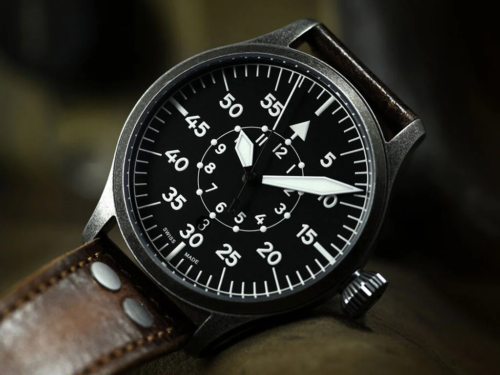
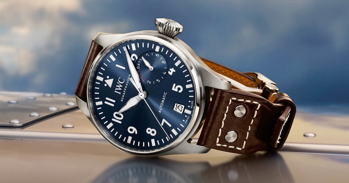
Two major dial layouts, “Type A” and “Type B”, emerged. Type A prioritises the hours (1 to 11) with a triangle at 12, while Type B brings the minutes to the foreground (large 5–55 scale) and relegates the hours to an inner ring. Why? Because for navigation, it’s often the minute that matters. This logic of visual priority—minutes first—is a lesson in functional design that watchmaking still cites today.
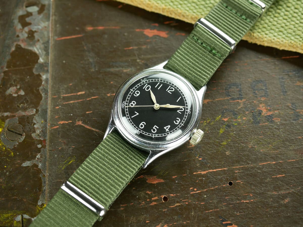
RAF, A-11 and other Allied standards: the tool above all
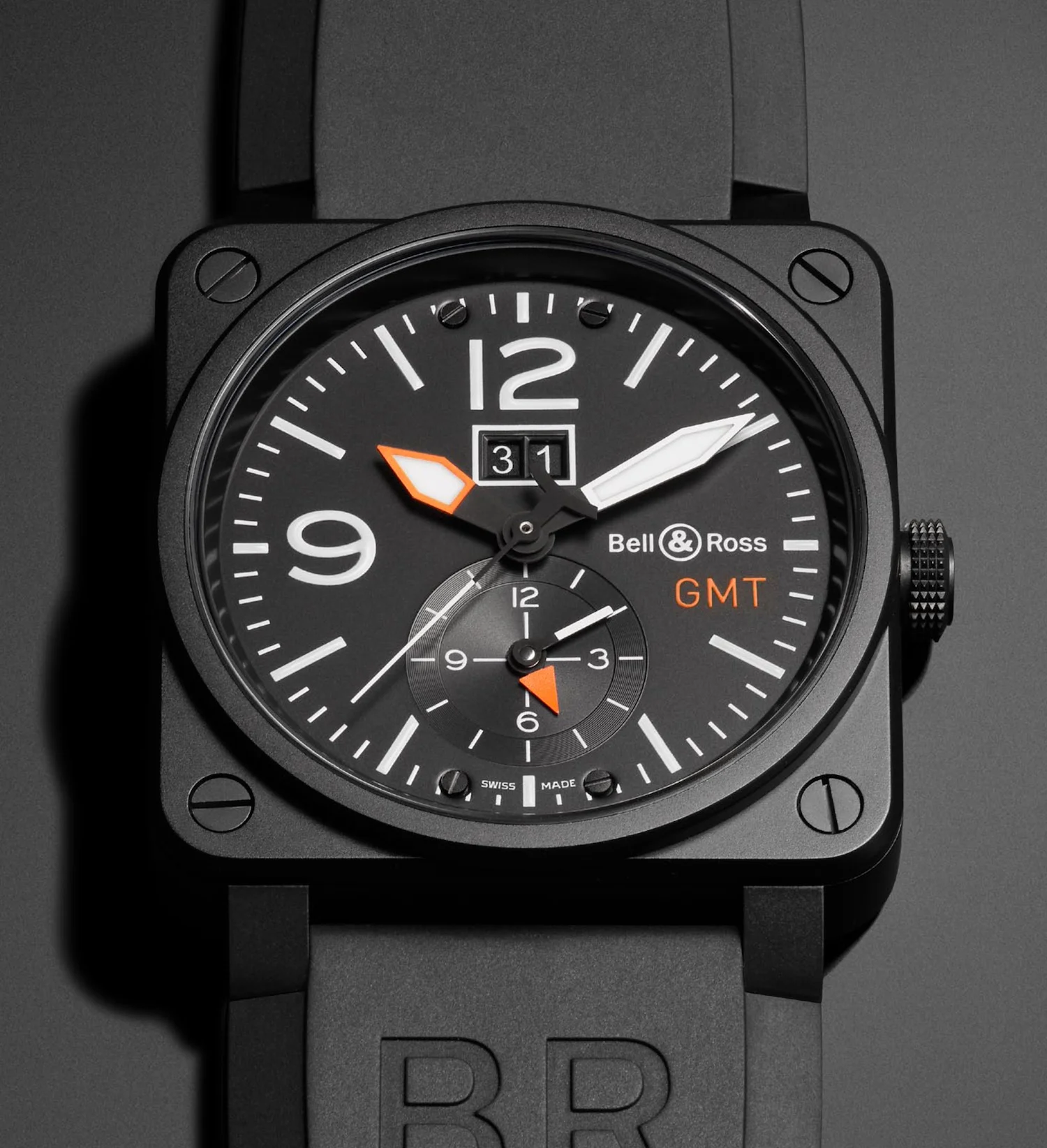
On the Allied side, the philosophy is similar: robust watches, stripped-back dials, simple typography, and a strong presence of luminous material. Certain specifications imposed constraints on legibility, accuracy and maintenance. The result: an austere style, but brutally effective—and today, iconic.
The technical ingredients of a “legible” dial
1) Contrast: matte black, crisp white, and nothing in between
Most classic pilot’s watches rely on a winning pairing: a black dial (often matte) with white or cream markings. Matte limits reflections; black enhances the readability of hands and indices. Some models invert the scheme (light dial, black numerals), but the goal remains the same: maximise luminance differential.
2) Typography: a utilitarian font designed for instant recognition
Arabic numerals dominate because they’re read faster than indices alone, especially when you’re looking for a specific hour. Tool-watch typography avoids thick-and-thin strokes, overly fine serifs, and stylistic flourishes. Pilot’s watches popularised this no-frills horological alphabet, close to signage: the eye recognises shapes before it even “reads”.
3) The hands: more important than the numerals
A dial can be perfect; if the hands blend into the background, everything falls apart. Aviator’s watches therefore favour broad hands—often “sword”, “baton”, or “syringe” style—with generous luminous surface. Shape also helps instantly distinguish hours from minutes. And on many models, the seconds hand is slender but fitted with a marker (luminous dot, triangle, “lollipop”) to remain visible in motion.
4) The peripheral minute track: the ring of precision
The flange or railroad minute track is the pilot’s discreet tool. It lets you read precisely to the minute, sometimes to the half-minute. This peripheral scale acts like a ruler: the minute hand can “point” to it clearly. It’s also a way to keep the centre of the dial uncluttered, where the essentials happen.
5) Luminous material: telling the time when the light disappears
Luminescence—first radium, then tritium, and today mostly Super-LumiNova—is a cornerstone of legibility. It turns the watch into a night instrument. But here again, legibility isn’t just about “glowing brightly”: you need sufficient surface area, good distribution (hands and indices), and a daytime colour that doesn’t crush contrast.
Why this style still fascinates us: the aesthetics of function
Pilot’s watches have a particular cultural power: they tell the story of an era when watchmaking was a direct ally of exploration. The legible dial is the visible remnant of a world of maps, headings, mental calculations and rapid decisions. Wearing a pilot’s watch today often has nothing to do with aviation; it’s a way of embracing an idea—the honest instrument, made to serve.
And paradoxically, this restraint has created one of the most recognisable styles in watchmaking. A good pilot’s watch is identifiable from three metres away, like a silhouette. It’s modern watch design turned heritage.
Modern compromises: when marketing tries to blur the read
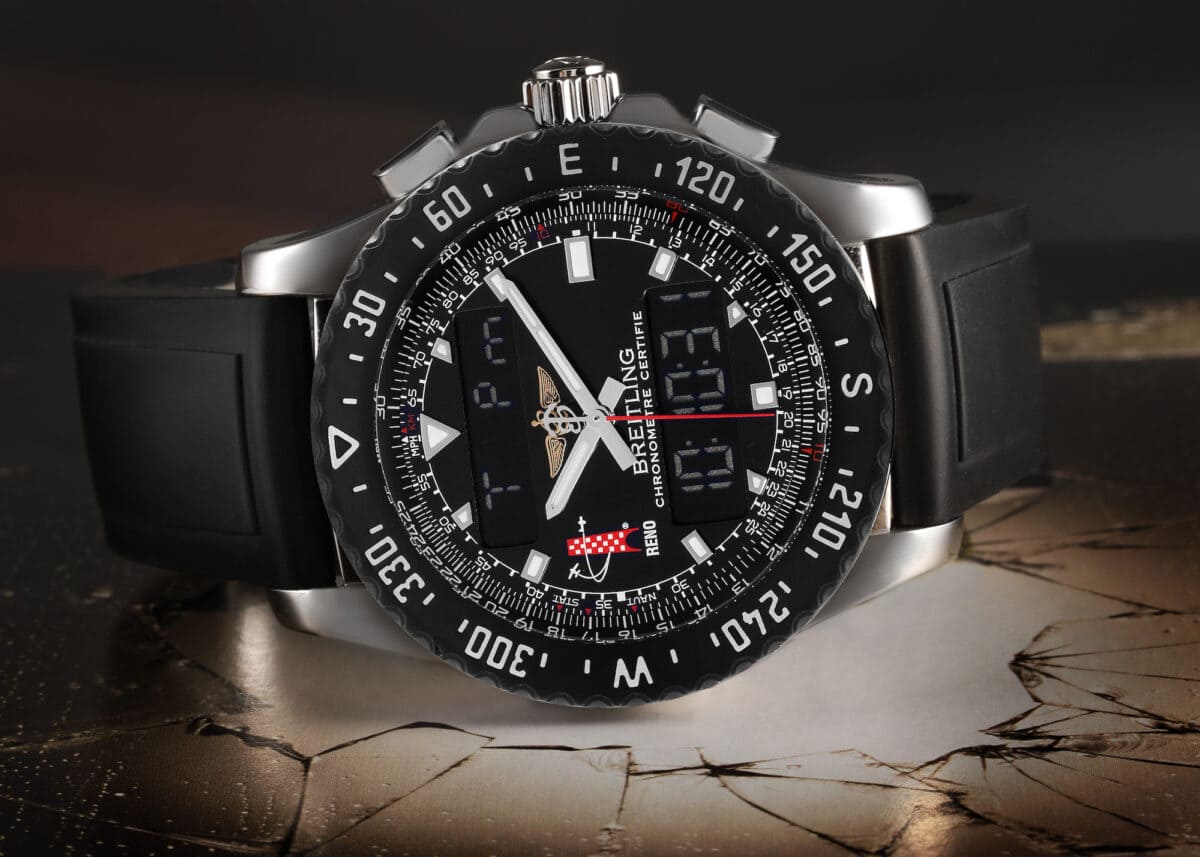
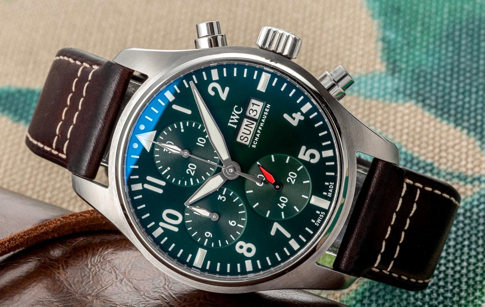
As the pilot’s watch became a style object, some models piled on complications, textures, logos and colours. The risk? Breaking the balance. Too much information, and the visual hierarchy disappears.
The best contemporary interpretations remain faithful to the essentials: legibility, simplicity, coherence. A pilot’s chronograph can remain highly readable, provided the sub-dials are well proportioned, high-contrast, and the main hands keep priority. Good design doesn’t oppose complexity; it organises it.
How to recognise a truly legible pilot’s dial
- Immediate contrast: matte background, crisp printing, hands that stand out.
- Clear hierarchy: minutes and hours readable at first glance, seconds visible without effort.
- Restrained typography: simple numerals, sufficient size, airy spacing.
- Precise minute track: useful graduations, aligned, non-decorative.
- Functional lume: indices and hands that are genuinely usable in low light.
Ultimately, a successful pilot’s watch is a visual “yes”
Why do pilot’s watches have such legible dials? Because they were born in a context where time wasn’t a comfort, but a navigation parameter. And because a good dial, in aviation as elsewhere, isn’t the one that invites admiration—it’s the one that makes itself understood.
In a world saturated with signals, the aesthetics of pilot’s watches continue to appeal for a very contemporary reason: they don’t negotiate with the essential. With the restraint of well-designed objects, they assert that information must be clear… especially when it matters.