Why Index-Free Watches Appeal to Minimalists
The quiet obviousness of a bare dial
You catch it at the edge of a cuff: a near-blank disc of colour, crossed by just two hands. No numerals. No markers. Nothing to distract the eye. This absence, far from being a lack, is a promise—of watchmaking reduced to its essence, where the dial becomes space, breath, a pause. In a world saturated with notifications, index-free watches speak softly yet carry far. They appeal to minimalists, but also to anyone for whom design is a culture and restraint a luxury.
Fewer cues, more intention
Minimalism isn’t an exercise in asceticism; it’s an intention. On a dial without indices, every decision matters: hand length, case proportions, crystal curvature, surface texture. Emptiness isn’t decoration—it’s a material. It shapes our perception of time the way an architect plays with light. Your gaze is no longer guided by a grid of hours and minutes; it settles, glides, returns. Telling the time becomes a sensation more than a measurement. Design, here, doesn’t embellish: it clarifies.
Cultural roots: from Bauhaus to Moser
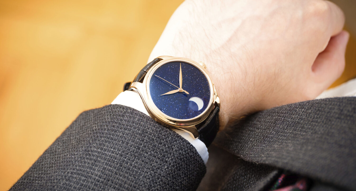
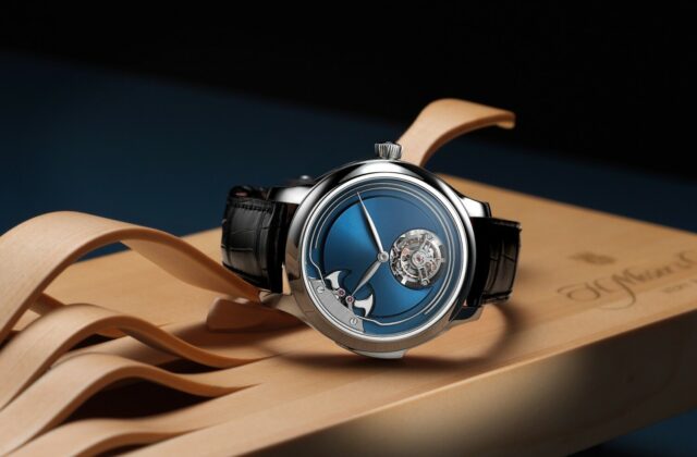
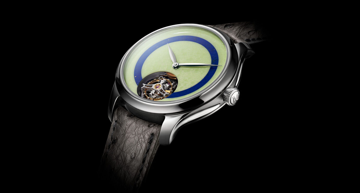
Tracing the lineage of index-free watches is to run into the masters of modernism: the Bauhaus spirit (pure form in the service of function), Dieter Rams’ ten principles (good design is as little design as possible), and the Japanese pursuit of sobriety that favours material over effect. In watchmaking, one piece stands as a manifesto: the Movado Museum (1947), with its single dot at 12 o’clock by Nathan George Horwitt, admitted to MoMA for its symbolic power—the sun at its zenith. Closer to our time, H. Moser & Cie has pushed purity to total silence with its Endeavour Concept models: no indices, no logo, smoked dials that catch the light like velvet. One also thinks of the ultra-thin lines of the Rado True Thinline, and certain Scandinavian and Japanese experiments where the dial becomes monochrome, almost meditative. Everywhere, the same idea: remove to reveal.
When legibility becomes an impression
The classic objection: without indices, how do you tell the time? What if split-second precision is no longer a contemporary watch’s primary mission? The smartphone rules surgical timekeeping. On the wrist, watchmaking savours its expressive freedom. With a bare dial, the indication becomes intuitive: the angle of the hands is enough to place the moment—and that is often more than sufficient. This “gestalt” reading rests on a few intelligent design choices.
- Hands of the right length: the minute hand reaching as close as possible to the rehaut, the hour hand drawn back toward the centre for clear proportions.
- Clean contrast: mirror-polished hands on a matte dial, or the reverse; restrained yet legible colours (black, ivory lacquer, smoked gradients).
- A slight crystal curve or a discreet rehaut: a visual guide without markings, like a cast shadow.
- Textured finishes: sunburst brushing, lacquer varnish, a velvety grain that catches the light and sketches time without numerals.
The grammar of a radical design
Minimalism demands mastery. On an index-free dial, no decoration comes to forgive a shaky balance. Everything is decided by proportions: a case that’s too wide turns emptiness into a desert; too small, and it suffocates the idea. Thinness matters—the “ultra-thin” profile heightens the sense of quiet elegance. The lugs must draw a fluid line; the crown should be present yet never intrusive. The back, often visible through a sapphire caseback, tells the counter-story: discretion in front, mechanics behind. It’s the aesthete’s favourite double act.
- Ideal diameter: often between 36 and 40 mm, so the emptiness still feels inhabited.
- Controlled thickness: a slim profile for elegance and easy slip under a cuff.
- Movement: a well-finished calibre (even a simple one) underscores the concept’s honesty.
- Lightly domed sapphire crystal: adds softness and subtle reflections.
- Dial colours: deep monochrome (black, anthracite, ivory) or nuanced smoked tones to play with the light.
Style: an ally to the minimalist wardrobe
An index-free watch wears like a beautiful white shirt: it doesn’t seek attention, it earns it. It speaks of taste as much as restraint. With a suit, it can advantageously replace the classic “dress watch”, adding a clear-cut modernity. With raw denim, it creates a chic, almost architectural contrast. The secret? Let the materials do the talking.
- Straps: smooth chocolate calf, matte alligator, greige nubuck, or a steel Milanese bracelet for measured shine.
- Palette: monochrome or closely related tones (charcoal, navy, sand) to extend the minimalist idea.
- Textiles: favour textures (flannel, twill, fine knit) that echo the pared-back dial.
- Jewellery: one companion piece (a signet ring, a slim bangle) is enough; the rest is superfluous.
A few icons and avenues to explore
To grasp the spirit of this trend, two reference points stand out: the Movado Museum, a museum icon and a manifesto of the dial reduced to an idea; and the H. Moser & Cie Endeavour Concept, arguably the purest expression of contemporary watchmaking minimalism. Certain versions of the Rado True Thinline also push restraint far, with an ultra-thin ceramic poetry. Around them orbits a galaxy of Scandinavian and Japanese projects, often in limited runs, in pursuit of the right line. The advice here is less about collecting names than about seeking balance—the kind that, on your wrist, makes you forget the watch and remember the feeling of time.
And tomorrow?
In an era of screens saturated with icons, the index-free watch is counter-programming. It offers a luxury of silence and longevity: an aesthetic dependent on neither trends nor updates. It appeals to minimalists because it refuses needless ornament, but also to design lovers because it reveals the watchmaker’s hand—bare, without artifice. In this purity, the dial becomes a playground for light, and time, an art of living. It isn’t less watchmaking. It’s watchmaking, minus the noise.